
PC Part Picker
A UX Case Study & Visual Redesign
Role
UX Research
UX Design
Visual Design
Team
Individual Project
Timeframe
Spring 2021
Context
In late 2020, I built my first PC. I was a Mac user and I had absolutely no knowledge or experience in PC parts or construction. The experience was challenging, but I wouldn't have been able to accomplish it without the help of PC Part Picker. Now that I know a bit more about PCs, I want to help others with their builds. PC Part Picker is not without its flaws, with this redesign, I hope to make PC building more accessible, especially for new users.
This project was researched, prototyped, designed, and tested as a part of Dr. Sookie Cho’s DH 110: User Interface and Design course at UCLA. All work was done over a 10 week period in Spring 2021.

The Challenge
PC Part Picker is a website that assists PC builders with choosing components and testing if they are compatible. It functions as an online catalog but also a social media platform where PC fans can share pictures of their builds. While the website itself is extremely helpful, the way it presents its features is not optimal. After conducting a Heuristic Evaluation, a few usability issues emerged:
Visibility of system status
All essential PC parts are listed and it is clear where to click to add a component. However, many unnecessary parts are also highlighted with equal importance, such as external storage and laptop.
Match between system and real world
The site throws dozens of products/components at the user, who may or may not be familiar with what each component does. It is especially difficult for first-time PC builders to understand.
Aesthetic and minimalist design
The visuals of the site, while still effective, could use a redesign.
A full Heuristic Evaluation can be reviewed here. Additionally, a Usability Test was conducted on the original PC Part Picker website with a new PC builder. A review of the survey, methodology, and recorded video of the test can be viewed here. Overall, both the Heuristic Evaluation and Usability Test confirmed that PC Part Picker is a great tool for experienced builders, but not beginners.
User Research
Target Demographic
The target demographic of my app will be teenagers and young adults who are interested in the PC building hobby and tech enthusiasts who are well versed in the field. PC building can be adopted by anyone of any age, so it is important to design a system that is both familiar to the target demographic but also inviting to older audiences. Moreover, the tech and engineering fields are undoubtedly male-dominated. However, it does not need to be this way. The visual design of my app must be gender-neutral and welcoming to all genders without bias.
App vs Web
The choice to design an app rather than a webpage was one made with convenience in mind. An app has all the capabilities of a webpage, such as browsing and shopping features, but with added mobility. Users can use their parts list as a shopping list and take their phones into brick and mortar stores to find products. Additionally, apps encourage social sharing features, adding community engagement to what was once an individual project.
Contextual Inquiry
To better understand the target demographic of my app, I conducted an interview using contextual inquiry and participatory observation. Through my interview, I learned the following:
YouTube as an external source of learning
At this moment, there is no “hub” for PC learning. Tutorials are scattered around various websites, but one very useful tool is YouTube. Videos are much easier to digest than long, wordy web pages.
Forums and community engagement are critical
Reddit forums are a social center for the PC building community. Additionally, the resale market for PC parts thrives on forums. Emphasizing the social aspect of the app will not only attract new users, but also create a community.
Small notes and tips
For a complete beginner, there are many small things to learn. Adding notes or cards with definitions of parts or build tips would be extremely helpful for beginners.


Low Fidelity Prototype & User Testing
Defining Tasks
After analyzing users and scenarios, I determined two key tasks (or functions) my app must perform:
Personalization quiz
A short, 1-2 minute quiz to help jumpstart a user’s PC build. The quiz will ask questions about budget, the purpose of the build, and the user’s experience with PC building to determine the best custom build for them. This quiz will also serve as an onboarding tool for new users.
Part Picker Tool
Suggest a build with parts based on the user's quiz results. The user will be able to edit the build to their liking. Additionally, users should have the option to start from a blank template and fully customize their build.
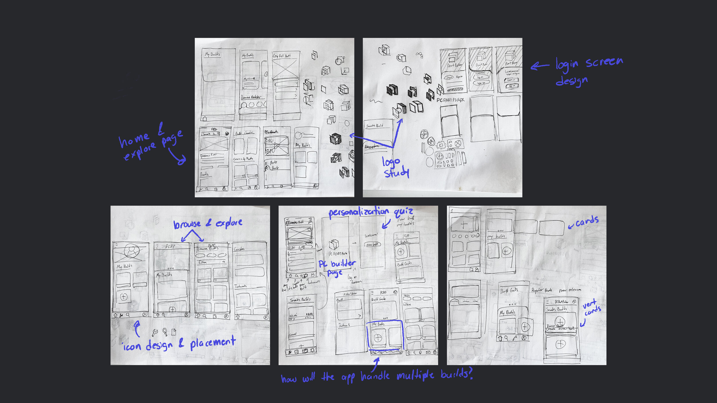
Sketches & Wireframes
My ideation process began with rough sketches with pen and paper, then once a general theme is developed, I moved to digital wireframes to reimagine my design. Read more about tasks and wireframes here.

Usability Testing
Each task was tested with 2 unique users to determine the intuitiveness of the low fidelity prototypes. I wanted to determine the following:
Can the user navigate the app and complete the tasks without trouble?
Do the wireframes feel limiting in any way?
Are the design and placement of buttons and icons sensible and easy to understand?
Through testing, I found that:
The personalization quiz could use a back button, a progress bar, and a final page confirming the submission of the quiz.
Hiding certain information is actually beneficial. Simplifying the interface and having “expand” buttons create a more efficient user experience.
I kept these notes in mind when adding more features and refining the design for the high fidelity prototype.
Visual Design
Logo Redesign
For the logo redesign, I wanted to create something simple and modern while also respecting the original design. The old design is actually very intuitive, and I wanted to preserve the memorable silhouette. Additionally, I wanted this logo to easily fit any color palette.
The new logo makes use of negative space to replace the gold block on the old logo. I also removed a part of the P in PartPicker to match. Finally, I removed "PC" from the brand name as it is a bit redundant and makes the name unnecessarily long.
Colors
I wanted to keep the colors very simple and almost monochrome. Black gives the impression of luxury and quality, which is what I want my users to feel when using the app and assembling their PC.
Typography
My font is MADE Evolve Sans, a clean san serif that is easy on the eyes and very versatile. The Bold is great for titles while the Regular is perfect for paragraph text.

High Fidelity Prototype
Software & Wireflow Diagram
My high fidelity prototype was designed in Adobe XD. Admittedly, my strongest program is FramerX, but I decided to use XD for this project to better familiarize myself with new software. The wireflow diagram and user interfaces took a bit longer than usual, but the extra time went into creative exploration, and I am happy with what I have learned.
Read more about the development of my high fidelity prototype here.

Interactive Prototype
Key Features

Log In & Sign Up
A new look to a familiar interface. This simple log in screen uses the “>” symbol to prompt users to enter their info, a reference to the start of a line in a console.

Personalization Quiz
A short, 5 question quiz collects information about the user to design a custom build. The system considers the user’s experience, budget, and aesthetic preferences.
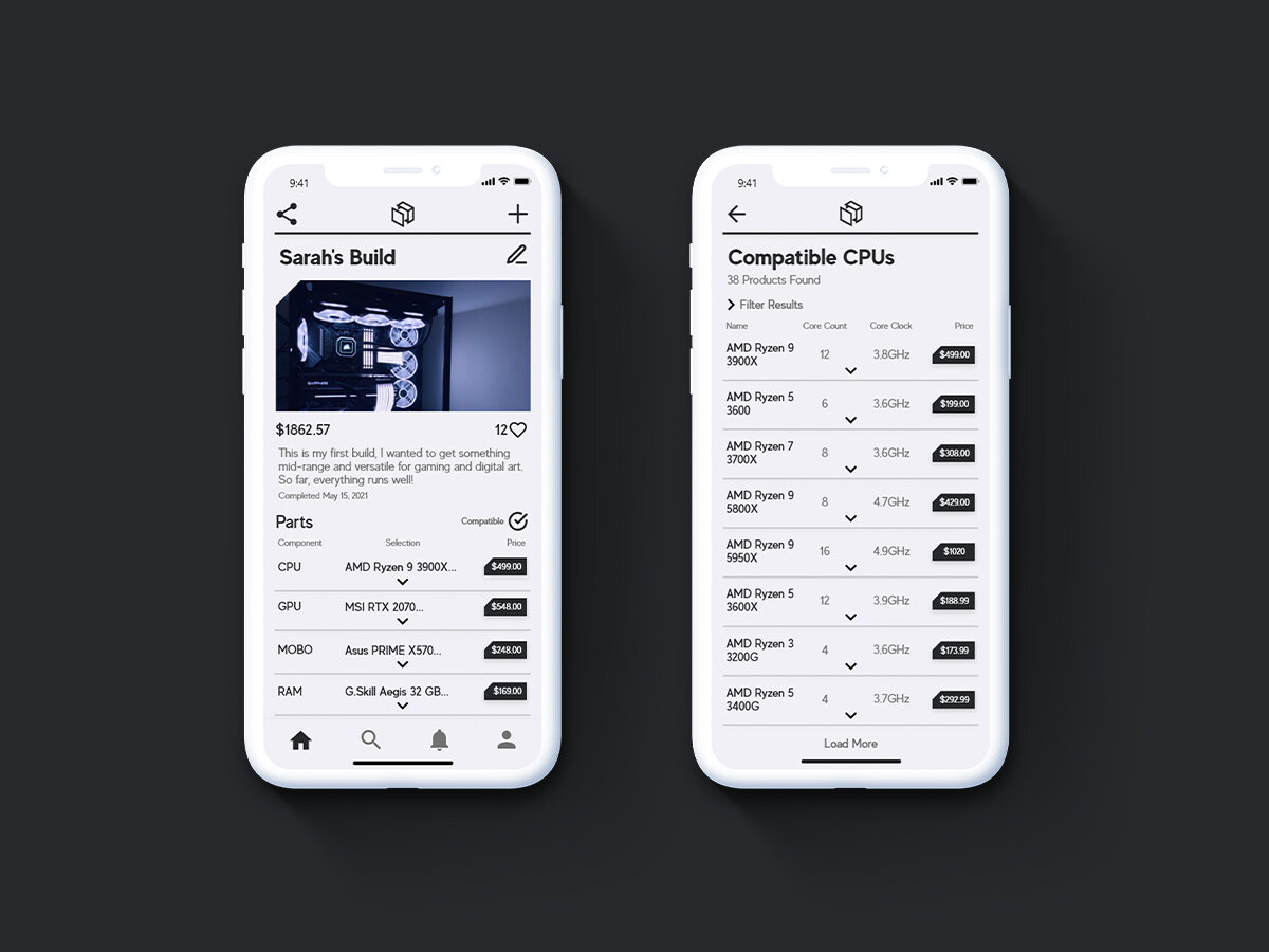
PC Builder Tool
A clean and sharable PC Builder Tool helps users find and record the parts they need. Users can then use their list as a personal shopping list or share their builds with the app’s community.

Share & Explore
Users can create a customized profile to share their personal builds. An Explore page recommends popular builds by other users while Build Guides provide tutorials designed by Part Picker.
Reflection
One of the most important lessons I learned from this project was the value of process and iteration. Mistakes, scrapped sketches, and minor setbacks are a normal part of the design process. Before, I would hide these mistakes and remove my sketches and process work from my final documentation. However, this project made me take a step back and embrace my failures. Though it can be frustrating at times, finally having a design or interaction click was the most satisfying feeling ever, and only motivated me to work harder.
Peer evaluation, critique, and user testing feedback are also essential to successful design. This project forced me out of my comfort zone and confront users for interviews. Although awkward at first, after a few rounds I began to understand the importance of communication and feedback.
Finally, there are many things I have to improve and expand on in my current app. First and most obvious, many aspects of transitions and animations in the final prototype can be made smoother and more intuitive. Second, the final build of my app focused more on social sharing and community over learning and helpful guides. The first thing to tackle in further development will be the educational aspect of the app. Then, additional user testing will be needed.
Although this project began as just an assignment, I vastly underestimated how much fun I would have with this project. From sketch to final prototype, PC Part Picker is an assignment turned passion project.